Honda to adopt new logo in 2027

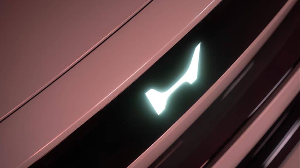
Honda announced a global corporate identity change, according to its official release. The iconic «H» on vehicles will be replaced for the first time in decades. The new «H Mark» will be used across the entire automobile division.
From EVs to a world standard
The «retro‑futuristic» logo without the familiar frame was first presented in early 2024 for 0 Series EVs. Honda now plans to begin introducing this new logo later in 2024, with a phased rollout: by 2027, all of the brand’s key models, including popular hybrids, will feature the updated logo.
What the logo symbolizes

This design solution is not just a tribute to minimalism. Thin lines in the «H» reference the 1963 logotype. The design of two open hands highlights innovation and focus on drivers’ needs. The new emblem reflects Honda’s drive for new mobility and intelligent technologies.
Large‑scale infrastructure transformation
The changes will apply not only to vehicles:
- Dealerships: showrooms worldwide will update their design and signage.
- Motorsports: racing teams will transition to the updated visual identity.
- Communications: marketing and advertising will be built around the new brand image.
Honda’s marketing team describes this as a «second founding.» Unifying the visual identity across all powertrain types marks the end of traditional engines and signals readiness for digital transformation.

